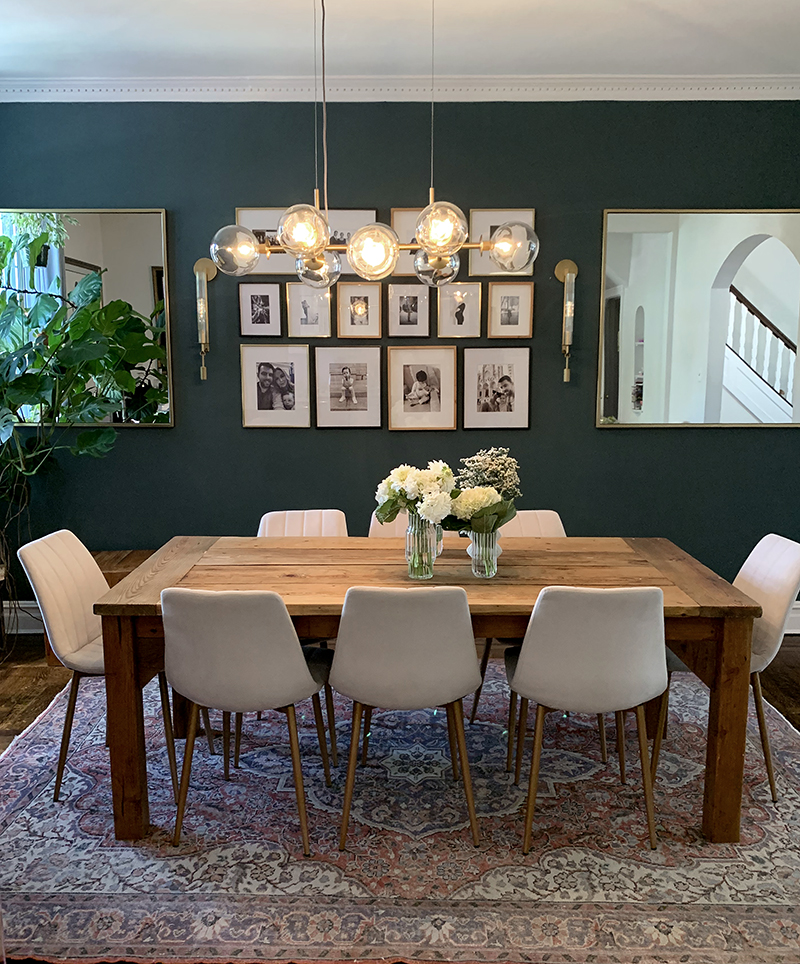

full dining room details, our design process with Devon Grace Interiors and our before photos at the bottom of this post
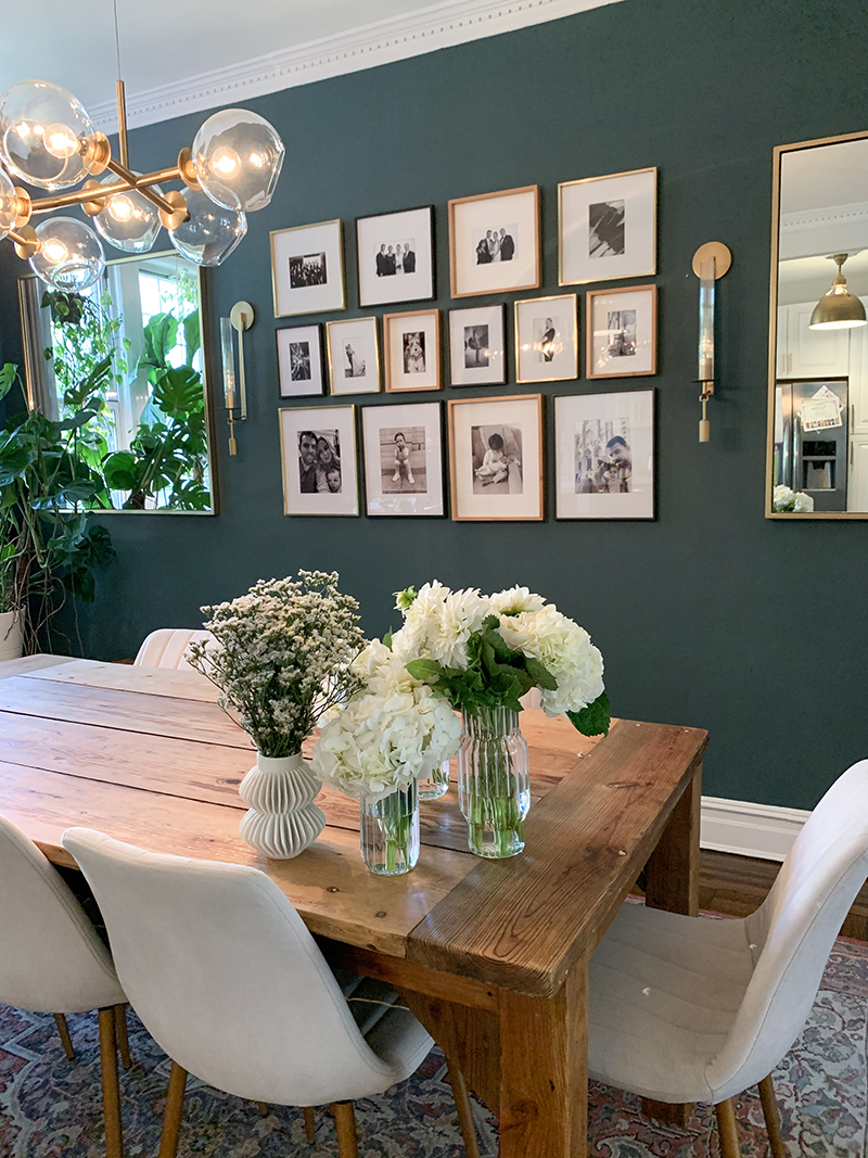
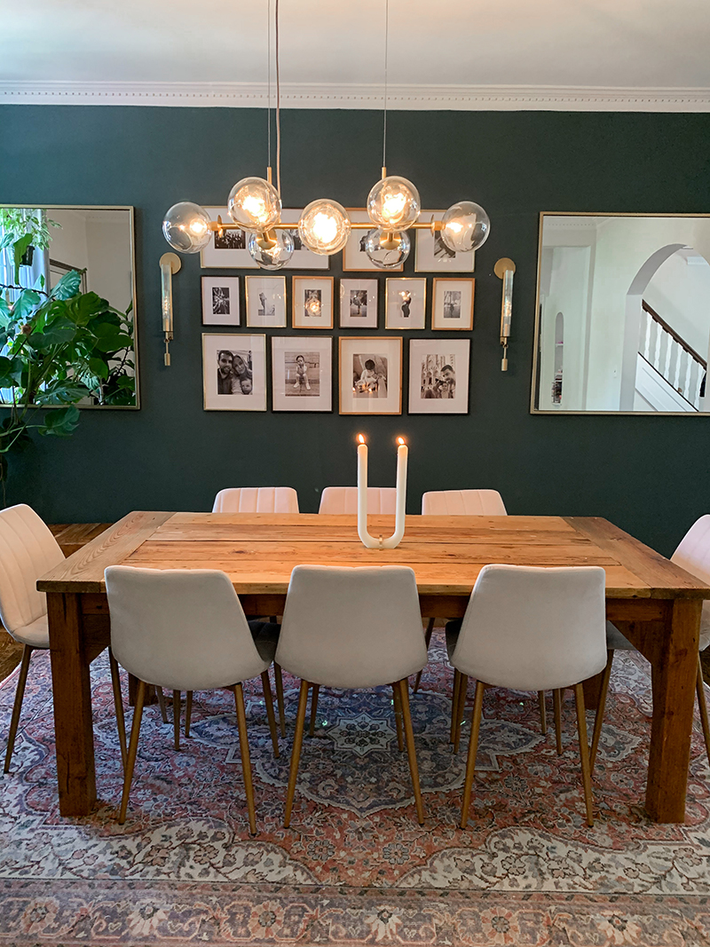
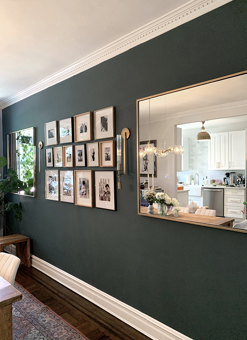
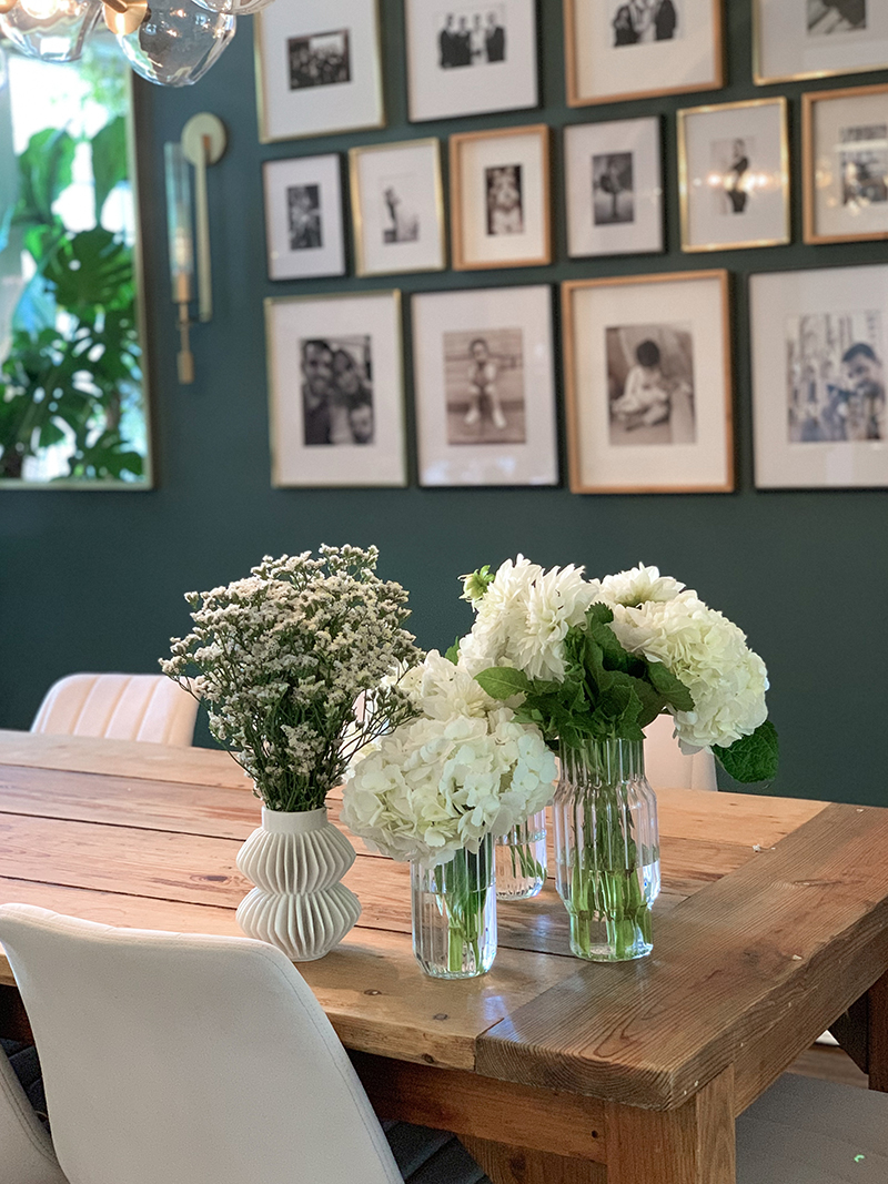 {everything is linked at the end of this post}
I’m thrilled to finally share our updated dining room and possibly my favorite room in our home.
We had the incredibly talented Devon Wegman of Devon Grace Interiors really bring our vision to life. Prior to starting the project, Devon and I went back and forth (via email) several times so she could really get a sense of our aesthetic, our end goal and where our heads were at. We went into the project knowing we wanted to style around a few key pieces that we already owned: the custom-made dining room table, our vintage rug and our light fixture. I knew that I wanted a gallery wall, but I wasn’t really sure how to go about executing it. I was also really debating a darker accent wall, but I was a bit nervous since I typically gravitate towards a softer, more neutral palette. Devon gave me the push that I needed and began mocking up some initial concepts.
The Process:
After some back and forth, Devon gave me some “homework” to really understand what look we were going for. She sent over a bunch of interior images for me to look over and to call out what I was into and alternatively, what I wasn’t into. I found the entire process to be quite fun, but it also challenged me, in the best way, to really understand what we wanted.
You can see all these beautiful images floating around on Instagram or on Pinterest, but those pretty images might not be right for your home. When you sit down and really pinpoint “well, I like this a lot, but not necessarily for me.” it gives you an opportunity to really focus on what the design goal is.
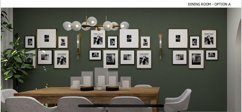
I didn’t realize I’d get such detailed mockups, but technology these days is pretty mind blowing. The below is a computerized photo of our living room with ‘Option A.’ It shouldn’t amaze me so much, but it really does. It helped us understand the small tweaks we considered making. After we got this first round, we knew we were heading in the right direction, but wanted to see what the wall would like like if we had less frames, added some mirrors and went with a richer hue.
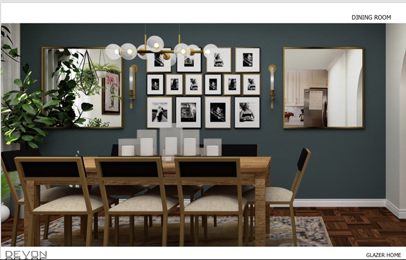
A few days later, we got the below and voila! Our current dining room (with a change in chairs) mocked up using their incredible technology! Being able to see our dining room, before actually committing to it, was pretty amazing. The below was the winner and Devon and her team handled all of the ordering of product, hiring the appropriate people to paint, hang up the gallery wall, the mirrors and bring our dining room to life.
 If you’re debating hiring someone for a project, whether it’s a full home or a room, I cannot recommend Devon and her team enough. Not only is the team incredibly talented, but they were such a pleasure to work with.
I know that one question that will often come up is: “but what if you don’t live in the same city?!” I had the same question, but truthfully, it really didn’t matter!
You can find Devon’s website and portfolio here and her Instagram (with so much information in her highlights) here.
I am also sharing a video of our dining room on my stories, which gives a much more interactive/detailed overview of what the room looks like and the flow. Highly recommend checking it out! It will be saved to a ‘Dining Room’ highlight.
The Details:
Paint Color: Farrow & Ball Inchyra Blue
Frames: West Elm
Sconces: Restoration Hardware
Wall Mirrors: West Elm
Rug: Vintage via Etsy: I search the word “Oushak Rug” on etsy.
Table: Custom
Dining Room Chairs: Sunpan
Light Fixture: West Elm
White Vase: CB2
Clear Vase: Fferone Design
U Shape Candle | Glaze Studio
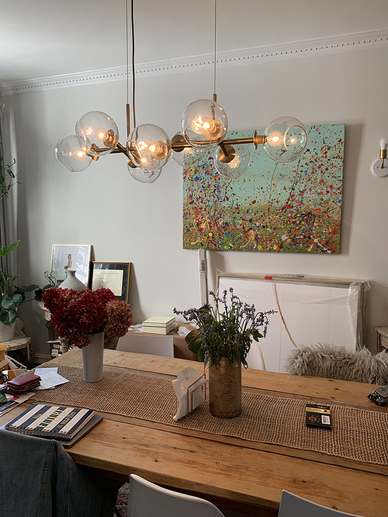
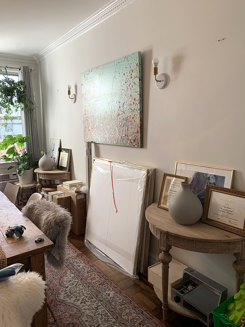
Lastly, find two of my before photos below! We also had two mirrors up, but I forgot to snap proper photos before taking them down. However, it still shows what an unbelievable upgrade our dining room had.

No comments:
Post a Comment